UI / UX Design + Illustration
Baby-G Anniversary Site
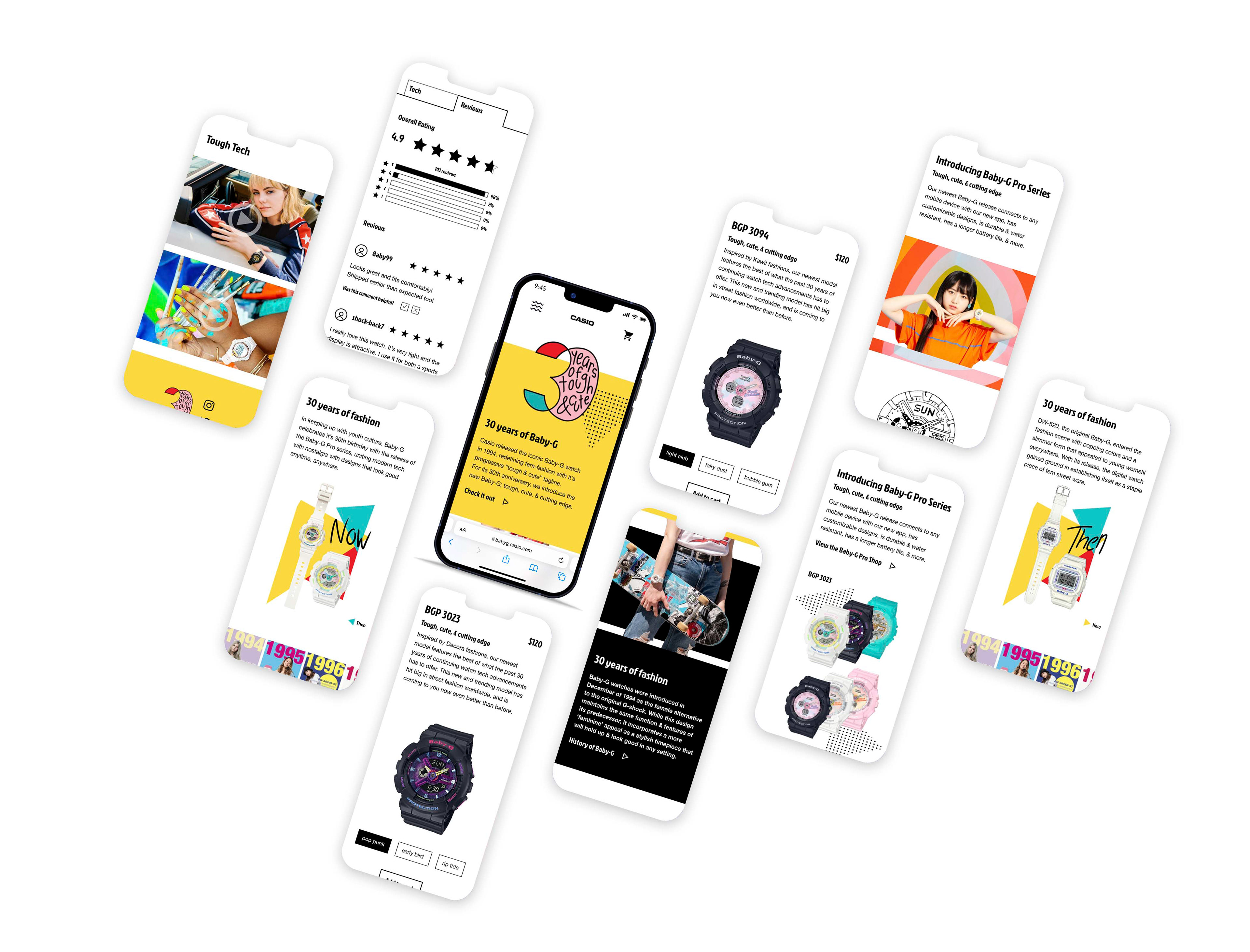
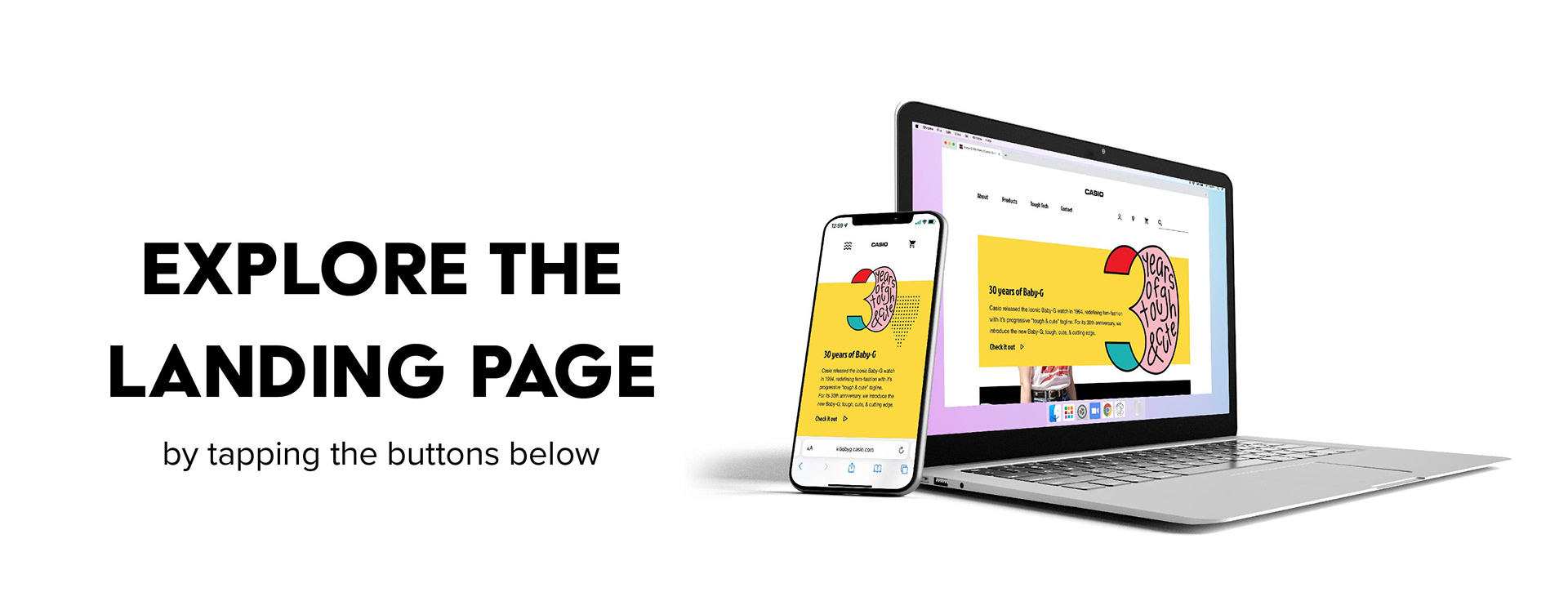
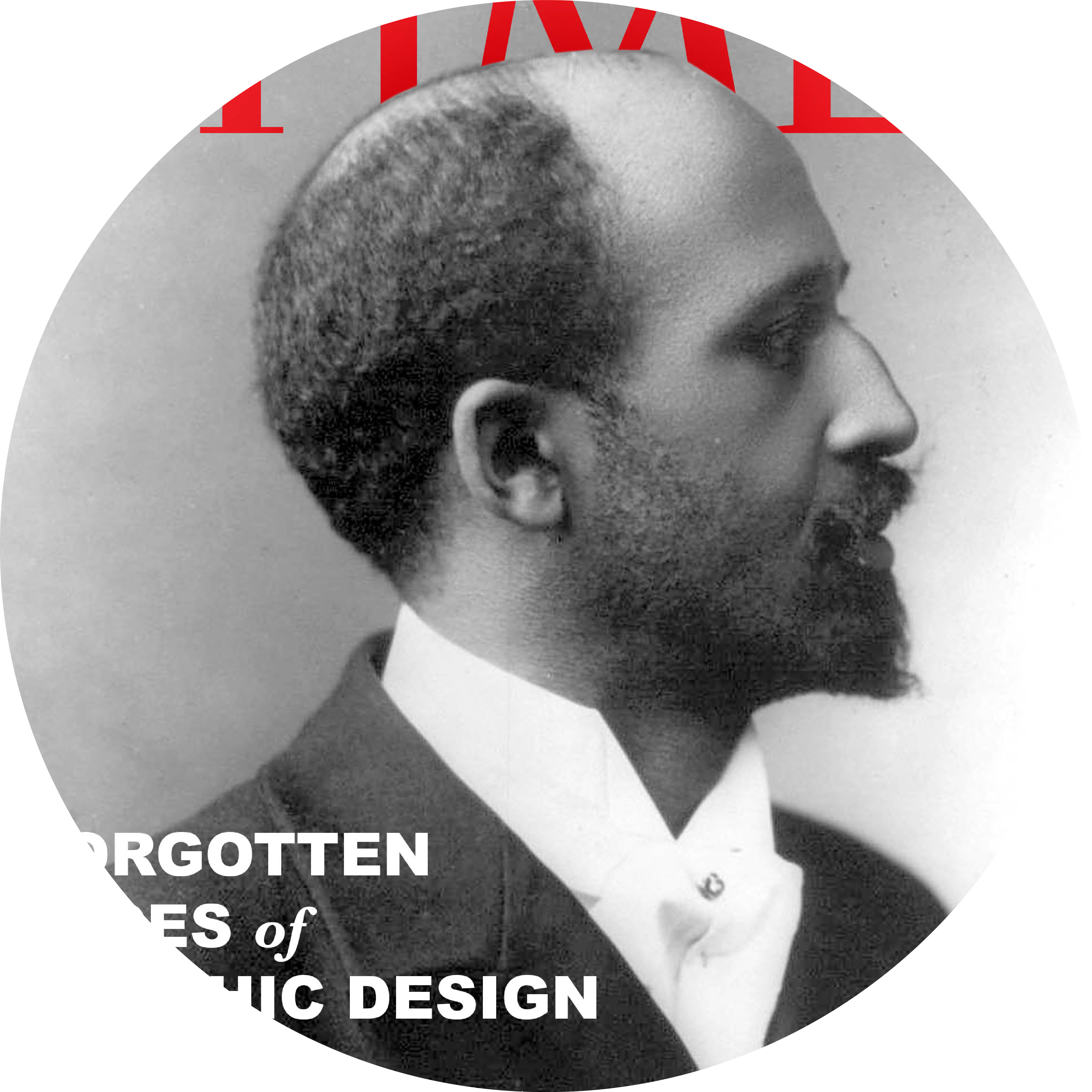
Casio released the iconic Baby-G watch in 1994, redefining fem-fashion with it’s progressive “tough & cute” tagline. For its 30th anniversary, I created a hypothetical re-release of the product; tough, cute, & cutting edge. The site functions as both an e-commerce platform as well as a marketing tool to emphasize the products longevity and relevance still today. This is best represented by the “then and now” history feature with a carousel of Baby-G on the covers of magazines for the last 30 years. By highlighting their origins with both content and imagery, every element comes together to point towards the new age of Baby-G.
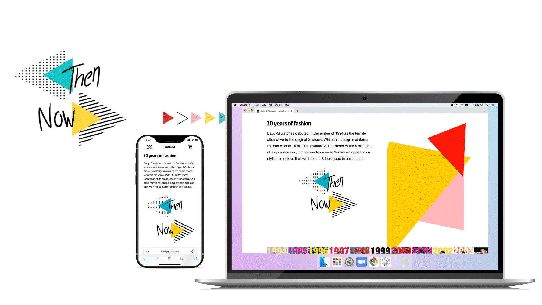
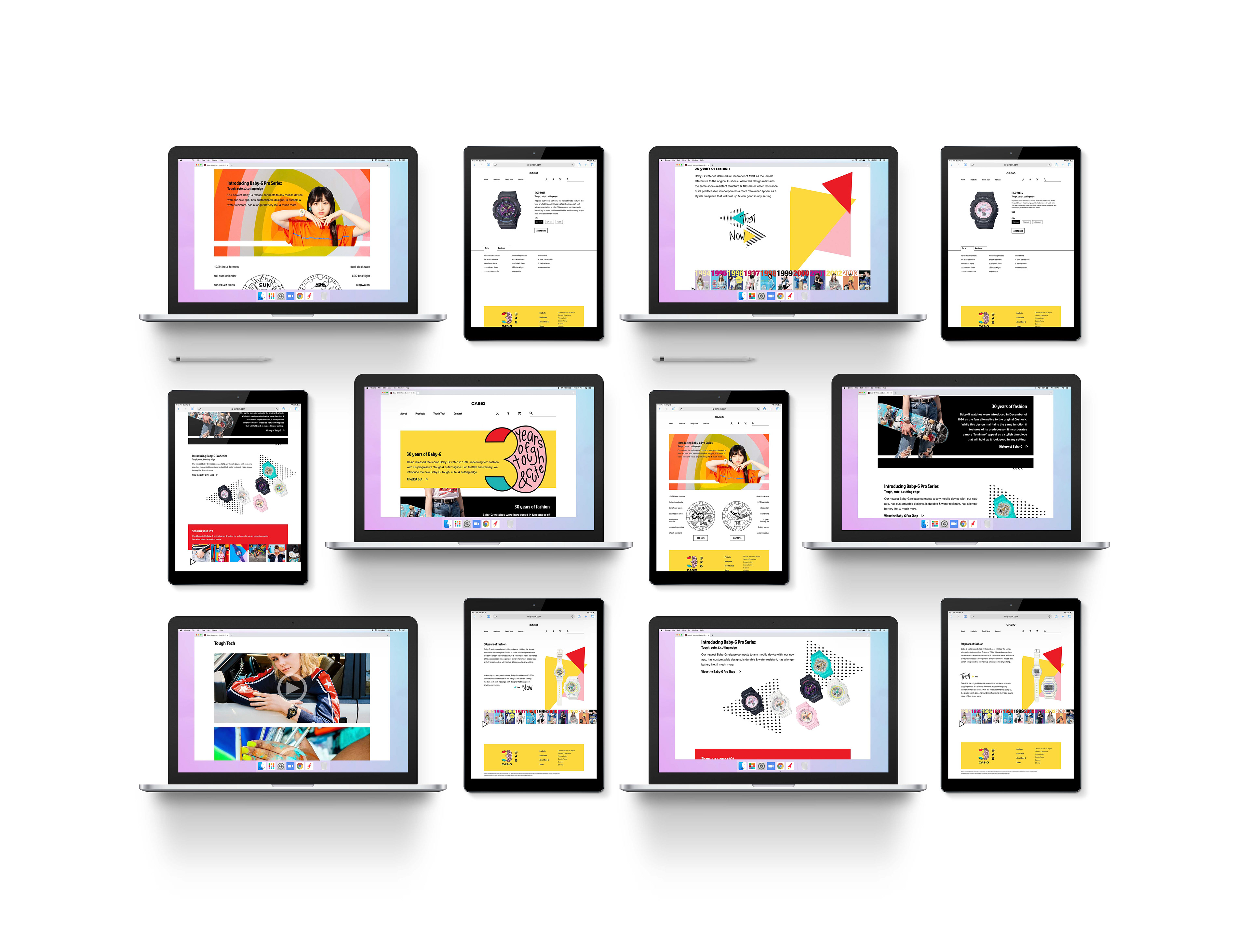
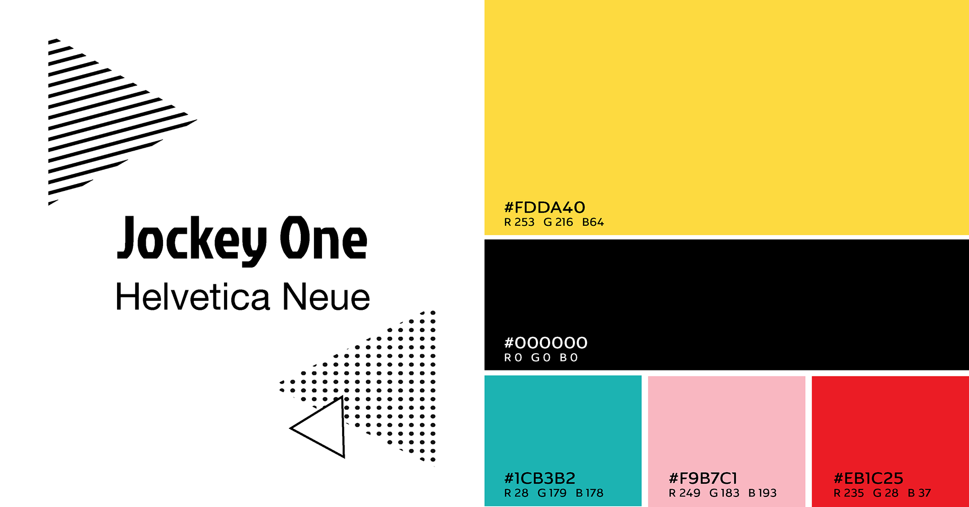
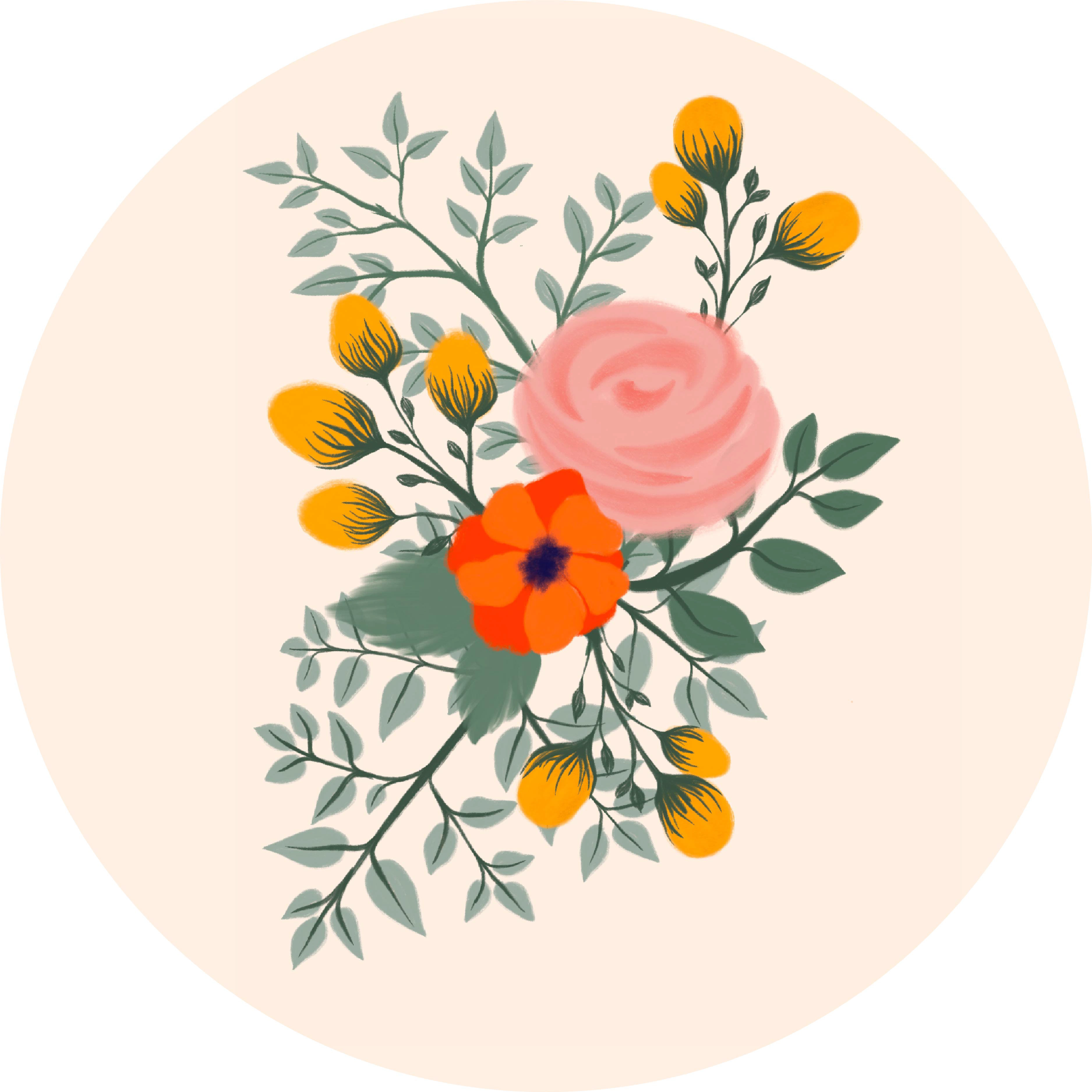
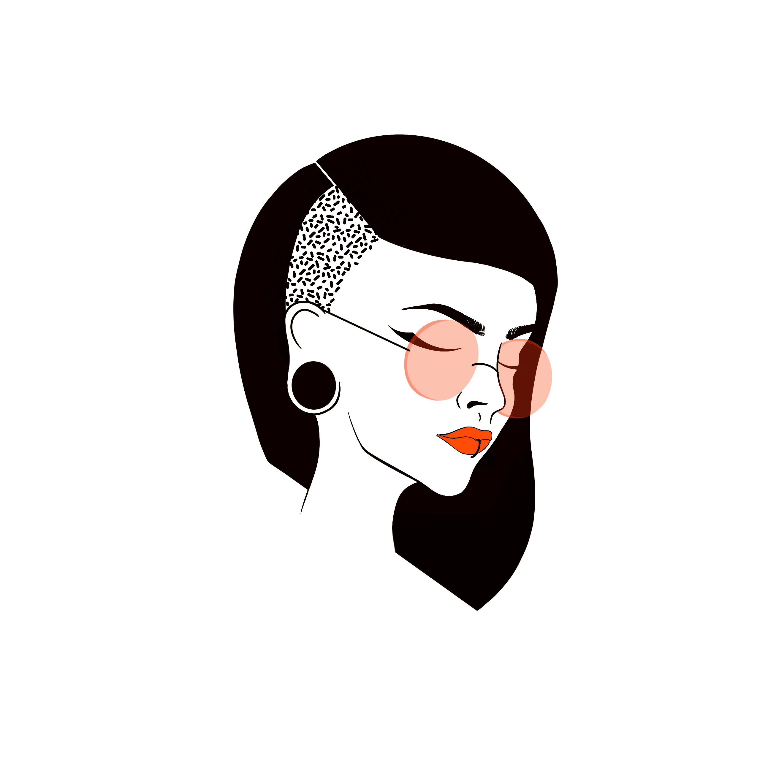
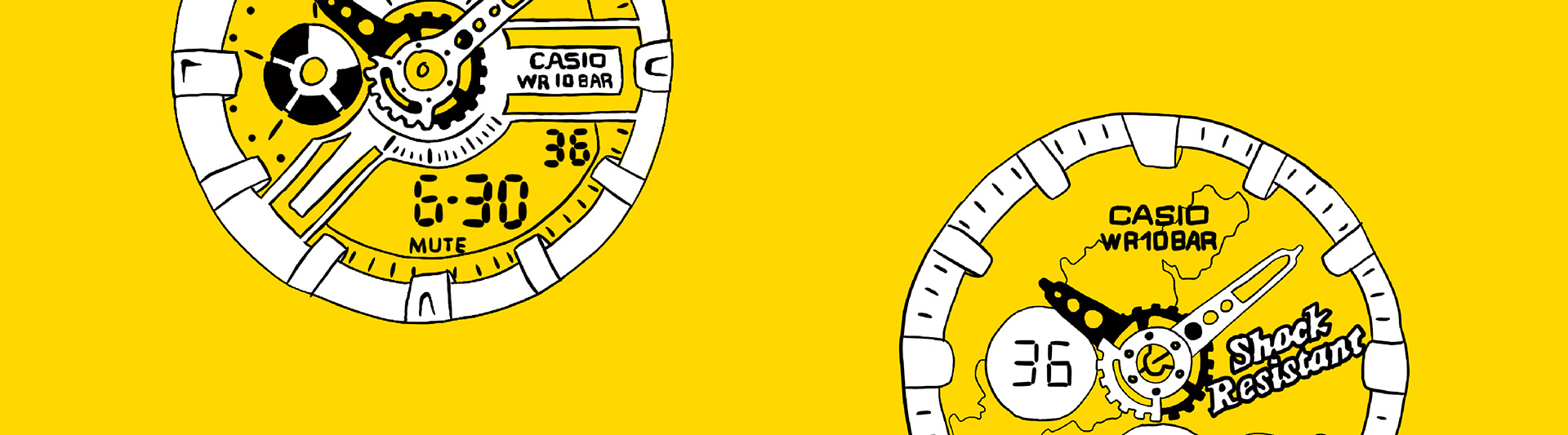
Reflecting on the past while looking to the future is a reoccurring theme seen throughout the website in both the content and visual design. This motif is carried by the emphasis on Baby-G's original watch design and fashion profile as well as by the patterns and illustrations throughout that reference a popular aesthetic of the 90s. The bold, blocky shapes, patterns, and colors, come together to create a pallet that is both bold and feminine, reflecting the tagline of “tough, cute, and cutting edge.”